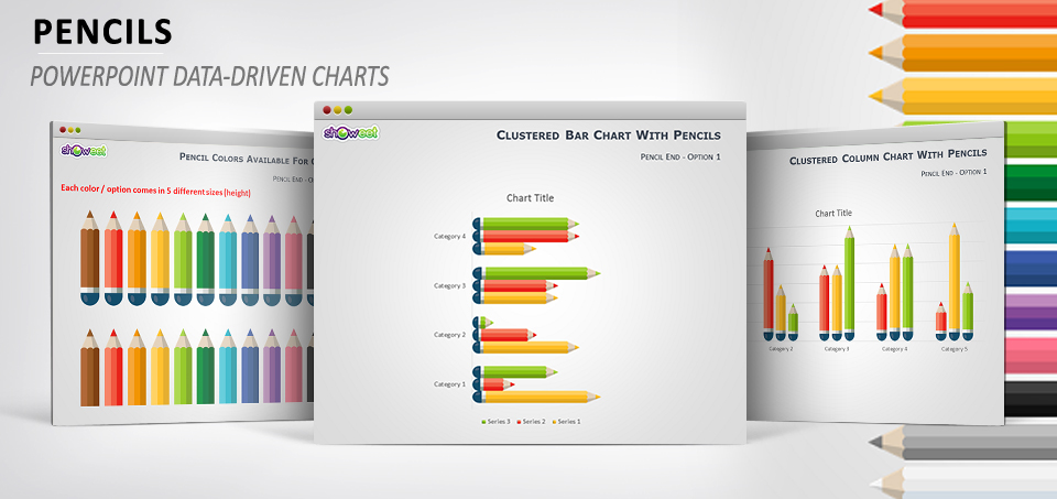
Spice-up your PowerPoint graphs with these free data-driven charts using colored pencil shapes. Great for infographic illustrations. Presentation package includes 1 PPTX document with column and bar charts and 260 images (png file format) illustrating 13 colors. Each color comes in 2 orientations (horizontal and vertical), 2 designs and 5 sizes.
Presentation Package includes:
- 8 slides
- Font Used: Calibri
- Format available: PowerPoint 2007-2013 (.PPTX)
- 260 images variants (13 colors, 2 orientations, 2 designs and 5 sizes)
- Licence: Creative Commons Attribution-NonCommercial-ShareAlike 3.0 Unported (CC BY-NC-SA 3.0)
Slides included:


Features and how-to’s:
Step 1: insert your chart
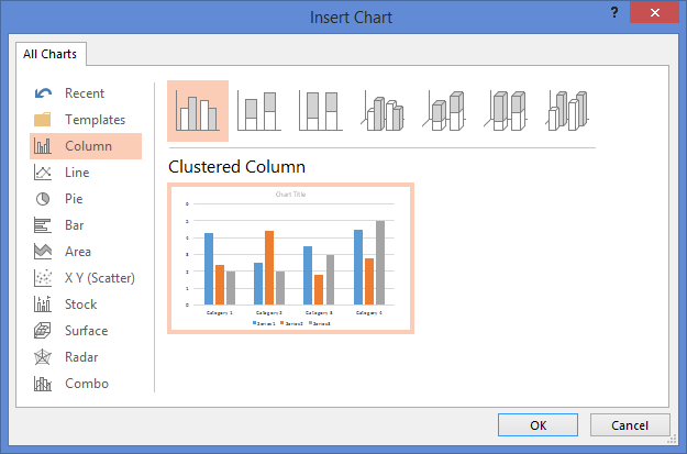
Go to Insert > Charts > Column or Bar
Step 2: select the bars or columns
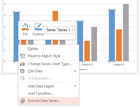
Click on the bar. You can either select a single bar or the whole series.
Go to Then > Format Data Series
Step 3: select the background of the series
Go to Format Data Series > Picture or texture fill
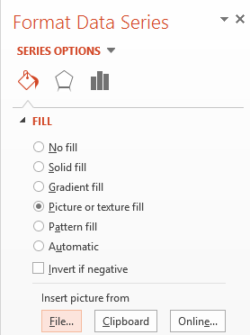
Step 4: insert picture
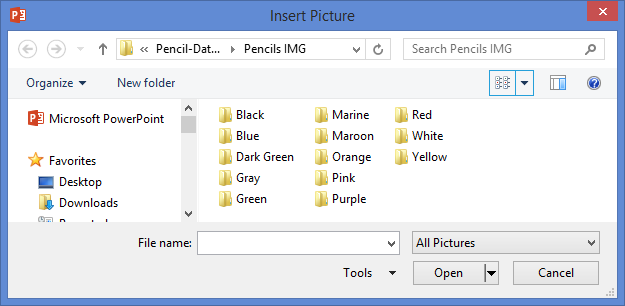
Select the picture you want to insert among the different options available (the ones you extracted from the zip file, in the “Pencils IMP” folder).
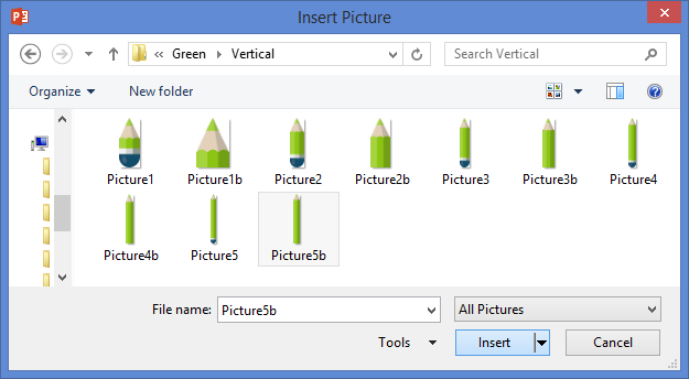
If you are working with a ‘Column’ chart, then select an image from the ‘Vertical’ folder; for a ‘Bar’ chart, then select the ‘horizontal’ folder.
Step 5: the result
Additional comments:
2 types of pencil designs are available:
Horizontal orientation:![]()
Vertical orientation:![]()
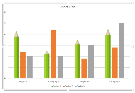
5 different sizes are also available. Use them wisely to avoid the shapes to be distorted / stretched in your graph.

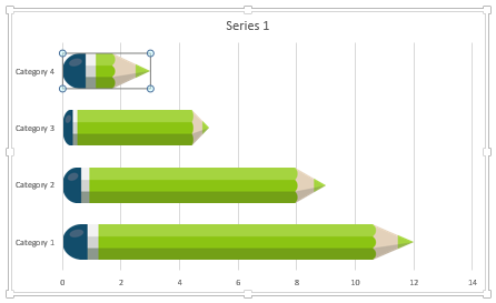
For example, this graph is using the same picture. You will notice that the sides of the pencils are distorted and uneven… to avoid this effect, select a different picture size for EACH bar or column.
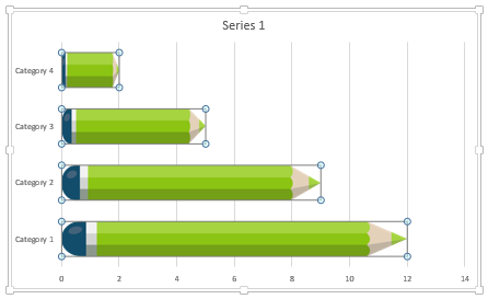
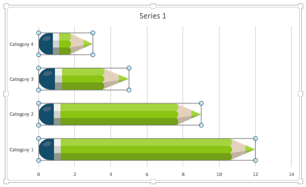
Repeat for EACH bar/column. You should then get this final uniform and optimized result:
Merci beaucoup pour votre assistance et votre support,
Vos supports outils sont très utiles dans mon travail quotidien.
Aicha – Tunisie.
@ aicha: Bonjour Aicha, ravi que nos ressources vous soient utiles… merci pour ce message.
Dear All.
Thank you so much for your work, and for sharing it.
All the best.
Francisco
@Francisco: Hi Francisco, thank you very much for your comment! Very glad you like our work.
Bravo et merci pour ce travail remarquable et ce partage inouï .
Merci beaucoup !! 🙂